


1
2
3
4
5
6
7
8
9
10
11
12
13
14
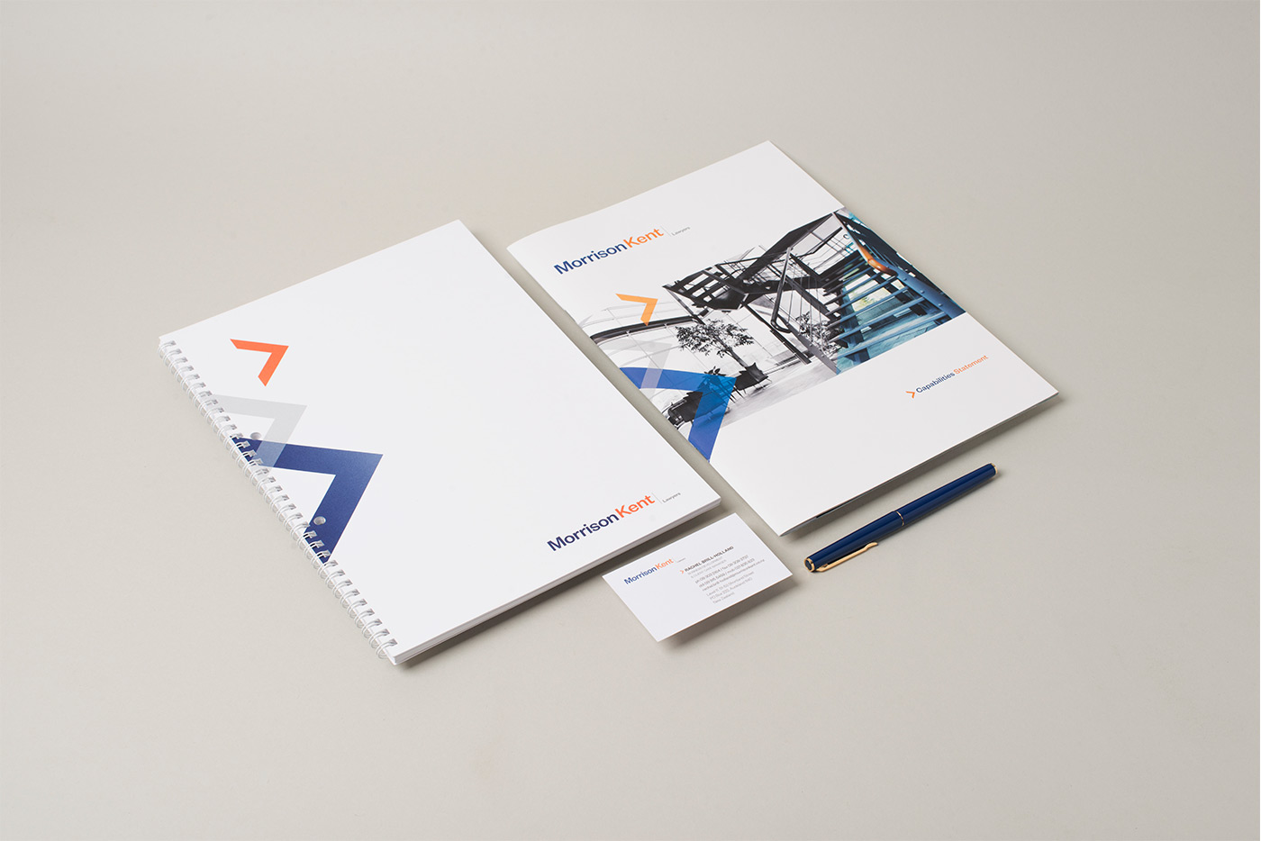
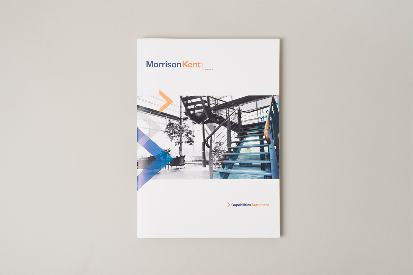
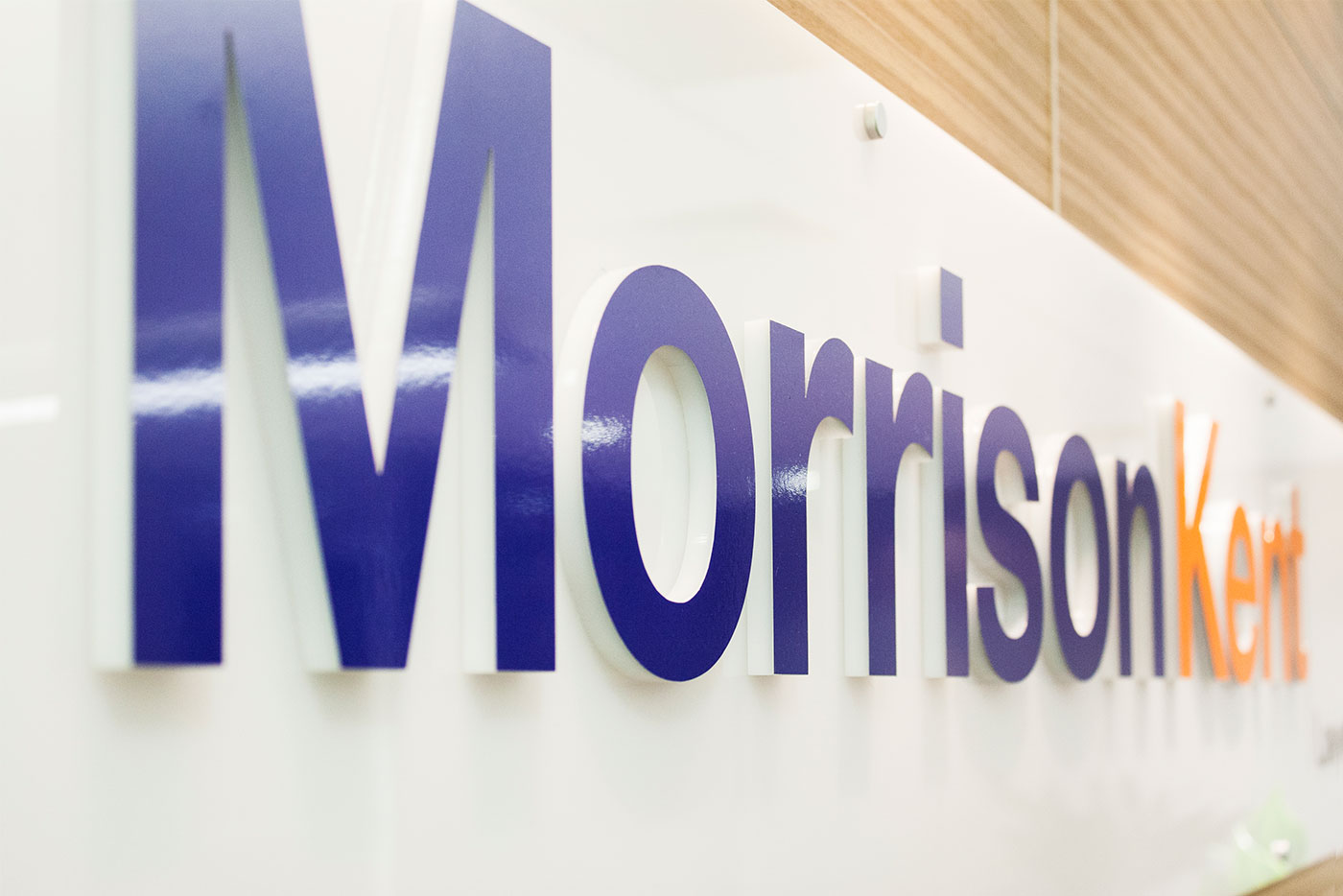
MorrisonKent Lawyers had a muted, conservative brand identity which really didn’t represent their values or approach to business. They needed an image that they could be proud and which reflected how they work – savvy, approachable, agile and sharp, but not excessive or extravagant.
Injecting a refreshing, vibrant orange to balance their trustworthy, dependable blue immediately lifted their visual intensity. A supporting directional arrow device creates a feeling of forward progression and dynamism while visually connecting the range of brand collateral, including corporate stationery, signage, brochures and website.